Anoka Faruqee on Bridget Riley
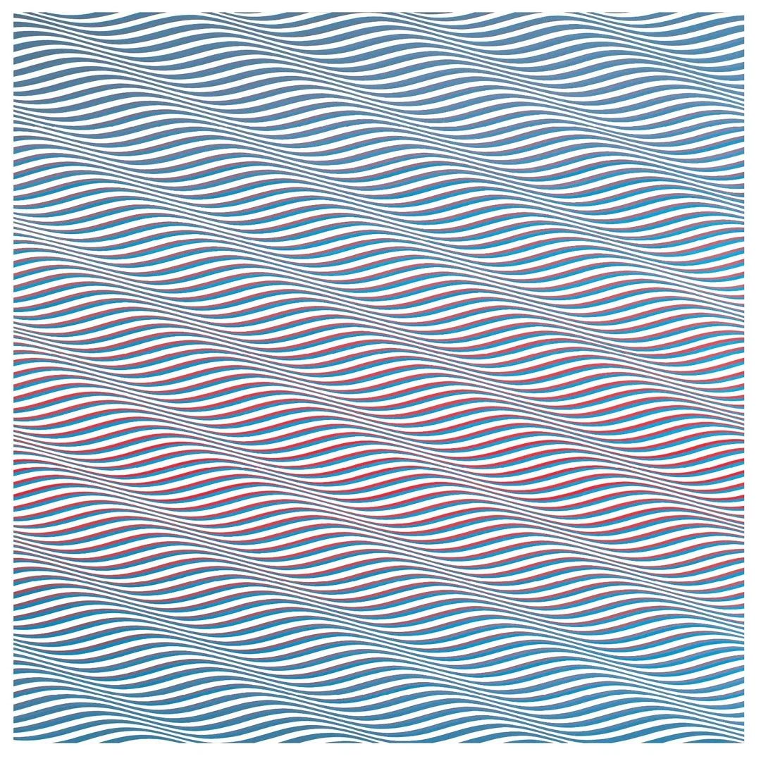
 Bridget Riley, Cataract 3, 1967, PVA on canvas, 88.5 x 87.5 inches
Bridget Riley described the experience of viewing her paintings as an “active, vibrating, pleasure,"[i] and was surprised and annoyed that others considered her work painful to look at. While art historian Pamela Lee calls Riley’s annoyance defensive,[ii] I can understand Riley's position. Having just visited the mosques of Istanbul and the sari shops of Dhaka, I’m reminded just how strange it is to call the painting Cataract 3 over-stimulating. I know that perception is subjective, but since my own reception of this work is so opposed to the experience of pain, I have always felt that describing the work as visually aggressive is a sign of visual inexperience or the result of cultural provincialism. To those who complain that the work induces piercing headaches or stomach-turning seasickness, I say: as with food or drink, expand your tastes and increase your tolerance, live a little.The instant I saw it, the painting began to undulate before me, an animation of colored light and waves. The feeling was rhythmic, pulsing, floating. Cataract 3 is a bit larger than a double glass sliding door. Despite its shimmering presence, the surface of the painting is sober, dry and matte: the weave of the canvas is evident and the paint application straightforward.Gray-green wavy lines progress down the painting, becoming a saturated two-tone set of red and cyan, emanating red light. The warm red advances atop its cool cyan shadow. Our inborn tendency to see complementary afterimages, particularly when opposite hues are juxtaposed, amplifies the painting's glow.The white ground reasserts itself among the colored figures, lightening and clarifying them. In most places, the white is equal in width to the colored combo, but as the colored lines narrow along each downward-turning diagonal, the white widens, emitting a skim of white light atop a gray shadow. The crossed signals of light and shadow vibrate in these valleys, driving the movement in the painting.The horizontal, colored curves seem to widen a bit in a few areas in the middle and bottom of the painting, creating subtle fissures in the uniformity of the pattern, like threads pulled in a weaving. These fluctuations might be deliberate or the byproduct of a handmade execution or even the effect of changing color and value contrasts. In any case, the bands are thin enough that minuscule discrepancies are visually consequential. The painting is from 1967, the year Riley introduced color after some years of painting only in black and white. Riley concurrently committed to the narrow stripe form, which she describes as integral to her use of color: "essentially edge, without a large volume to carry is the ideal element to work with this elusive relationship between color and light."[iii] For example, Riley rejects the idea of a green triangle; a triangle’s solid volume and directional qualities assert themselves and compete with the use of color. Not wanting to simply ‘color in’ her earlier achromatic paintings, she re-imagines her forms for color.[iv]For me, this painting endures unlike more facile examples of Op Art, because, like a work of thoughtful science fiction, it uncannily compresses the past, present and future. Throughout her writing, Riley recalls the impact of specific perceptual memories. In this painting, one sees how she draws upon these lived moments, whether it was observing light across water, watching the bright blue sky fade into its complementary afterimage, studying the divisionism of Seurat’s dots and Moorish tiles, or engaging an all-over structural approach to figure drawing. She hones aspects of these past experiences in order to present a wholly new perceptual event tantamount to them.Riley embraces pre-planning, carefully considering and revising color, scale and composition via drawing: a practice of perfecting, rather than the pursuit of perfection itself. The elusive quality in Riley’s painting is more often achieved in other painters’ works through improvisation, gesture or accident. But what Riley presents is rather a universe of extreme structure that dissolves into luminescent and fugitive color. The ‘aura’ is not achieved through direct index, but through engineering. For this painting to achieve its fantastical presence requires a crucial austerity. There is always just enough in a Riley painting. She has vaporized out all the excesses of the sentimental past, because they might interfere with the immersive present and an emerging future.
 Anoka Faruqee, 2014P-43, 2014, Acrylic on linen on panel, 22.5 x 22.5 inches
[i] Riley, Bridget, “Interview with David Sylvester," The Eye’s Mind: Bridget Riley Collected Writings 1965-2009, Ed. Robert Kudielka, (London: Riding House, 2009), 95.[ii] Lee, Pamela, Chronophobia, (Cambridge: MIT, 2006), 176.[iii]Riley, Bridget, “Into Color,” The Eye’s Mind, 114.[iv] Riley, Bridget, “In Conversation with Robert Kudielka,” The Eye’s Mind, 104.

